 |
|
 Oct 03, 2006, 10:19 PM // 22:19
|
#61 |
|
Wilds Pathfinder
Join Date: Jan 2005
|
I do something similar and have both the mouse and number pad set up.
|

|

|
 Oct 06, 2006, 09:25 AM // 09:25
|
#62 | |
|
Re:tired
Join Date: Nov 2005
Profession: W/
|
Quote:
Against spike it is faster to click on someone as soon as you see the casters/rangers aiming towards them or warriors converging, from my experience. You don't have to spend that critical time checking their number. Against pressure builds reactions are less important, so it matters a lot less either way. I find it a bit awkward to switch from mouse to keyboard for targetting. |
|

|

|
 Oct 06, 2006, 08:50 PM // 20:50
|
#63 |
|
Desert Nomad
Join Date: May 2005
Location: USA
Guild: [GSS][SoF][DIII]
|
Mine is not as radical as many other people's here, but not very close to the default, either. I use the same setup for all classes, it doesnt change based on Im monk or war or w/e. Here it is:
 I operate on 1920 x 1200 resolution, so its very nice and spacious Changes from the default: - Effects monitor moved to ~center of screen, just under my character's feet, so I can notice and recognize them faster. (the actual position relative to my character can vary based on zoom level, but I always play zoomed out to the maximum so having the effects moniter move on top of my character's head is never a problem) - Compass enlarged so I can see the overall battlefield more easily, which in turn makes tactical calling easier. - Enlarged Skill Activation Moniter (under target's hp bar). So I can see what everyone is casting easier through peripheral vision. - While it does not appear in this picture, my upkeep moniter is enlarged but still in the default location (on top of the skill bar), so I can dismiss Divine Boon and/or Holy Veil faster if need be. My keyboard setup is also not that different than the default, but is extremely confortable for me: Q, W, E, A, S, D: Movement, completely default. Yes, that means that I use Q and E to strafe, whereas every other competitive game uses A and D. I never really got into CS or any of those games, so I the difference never really phased me. Its too engrained in me now, I dont think Ill ever be able to change. 1, 2, 3, 4, 5: Their default, corresponding skills on my skill bar. R, F, V: Skills 6, 7, and 8, respectively. 6 7 and 8 are too far away from my left hand to be hit quickly or accurately enough to be acceptable. These keys are much more conveniant. Space, C, T: "Do it", Select Nearest Target, Select Priority Target (Defaults) X: Select nearest item. (makes me 1337 at picking up dropped flags with x + space Tab, Caps Lock: Next Target, Previous Target. Left Alt: Ventrilo! |

|

|
 Oct 06, 2006, 09:25 PM // 21:25
|
#64 |
|
Academy Page
Join Date: Apr 2006
Location: Scotland
Guild: Ozone Guild [OzGw]
Profession: Mo/E
|
|

|

|
 Oct 25, 2006, 08:37 PM // 20:37
|
#65 | |
|
Ascalonian Squire
Join Date: May 2006
Location: Round Rock, Texas
Guild: Can't Stop Texans
Profession: Mo/
|
Quote:
|
|

|

|
 Oct 26, 2006, 05:40 PM // 17:40
|
#66 |
|
Ascalonian Squire
Join Date: May 2006
Location: Round Rock, Texas
Guild: Can't Stop Texans
Profession: Mo/
|
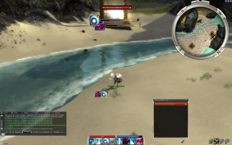
Wow, I stumbled on this topic by accident. And I really liked what I saw. So here is mine.
I have my skills 2x4. The party window to the left allows me to be only 2 squares away (I'm a mouser) from the party members. I can also close the party window when solo without haveing to move everything. I may still totally reset my skills so that the left column, which are skills 1,3,5,7 are what people usually have in 1,2,3,4 making them closest. I like having my U window open (I'm a mapper - and I get lost). The only problem I see so far is that my health and energy bars are a little out-of-sight stuck all the way to the right. I also turned off the "help" skill description (THANK U ANET (Nightfall update)) because that is always in the way. I threw in a recast of mending so you can see where that goes (no I dont usually cast mending when surrounded by many headed lizards interface.jpg Last edited by Kayla Slays; Oct 26, 2006 at 05:47 PM // 17:47.. |

|

|
 Oct 26, 2006, 09:44 PM // 21:44
|
#67 | |
|
Frost Gate Guardian
Join Date: Jun 2005
Guild: looking for a guild
|
Quote:
|
|

|

|
 Oct 26, 2006, 09:57 PM // 21:57
|
#68 |
|
Krytan Explorer
Join Date: Jun 2006
Guild: None, I don't play anymore.
Profession: Mo/W
|
|

|

|
 |
|
«
Previous Thread
|
Next Thread
»
| Thread Tools | |
| Display Modes | |
|
|
All times are GMT. The time now is 07:49 PM // 19:49.


 Linear Mode


